001 : timely
#userinterface | #userexperience | #userresearch | #visualdesign | #wireframing | #interactiondesign | #prototyping
This is a project completed for a User Experience class. It is a website designed to help people plan their schedules more efficiently.
October 2021 - December 2021
Background
Covid has disrupted the way in which people plan and schedule their days. People have spent nearly a year and half in a state of languishing. As we transition into a new way of regulating daily activities that are both onllne and in-person, most of us are having a difficult time figuring out what works best for us. The problem that's been suspected is:
People need help figuring out how to best schedule and plan their daily activities as well as help with managing their schedules.
Research
Approximately 50 college students across the nation were surveyed about their schedules and planning habits. When asked about whether or not they felt their schedule was best suited for them, 73% of them said no. In regards to their preference for a planner, 69% of respondents shared that they preferred to use an online platform, specifically a website, for planning purposes. After being provided a definition of languishing, in response to whether they experienced the feeling, 83% of respondents said yes. When asked about about if their schedule makes them feel burnt out, 65% of people shared that there's at least one day of the week where they feel burnt out because of their schedule.
Wireframing
After analyzing the interviews, it was evident that a platform that eased the process of scheduling, was stress-free, helped connect different platforms that are used for school, allowed for a time efficient experience, and provided personalized tips to users was the goal. The main features of the website would be:
Easy scheduling. Personalized tips and tricks. Connectivity for different platforms.
Usability Testing
After conducting user testing with approximately 15 students, people expressed three main changes that would be important to focus on for the next iteration of the prototype:
More personalization. More welcoming. Emphasizing connectivity.
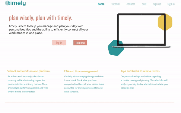
Final Prototype
After analyzing the feedback and trying to incorporate the changes. I changed the color palette to brighter colors and incorporated more white space so it would be easy on the eye. I added less on the homepage, but made the main features still apparent. Another change was made in adding a quiz to incoporate more personalization for the scheduling. I also created buttons that were more clearer for the user to be able to tell that they could be clicked on.
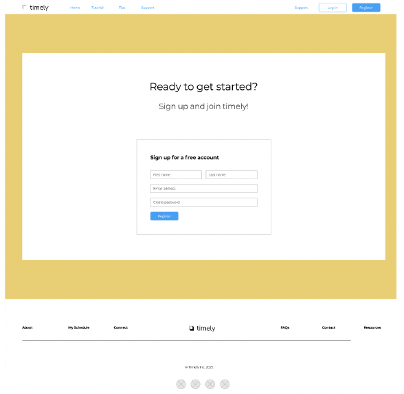
Signup Before
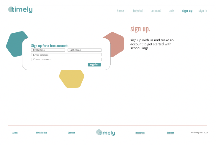
Signup After
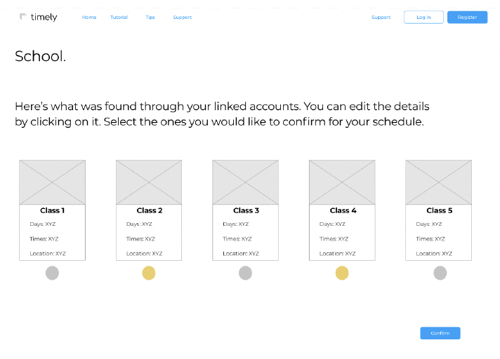
Scheduling Before
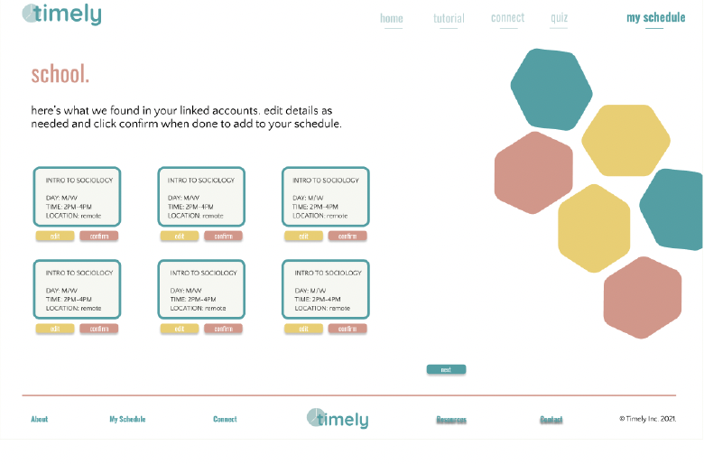
Scheduling After
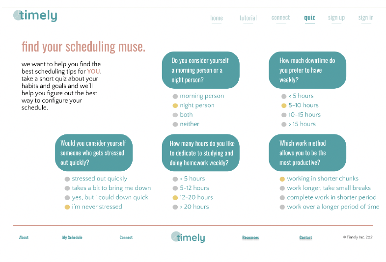
New Feature: Personalized Quiz
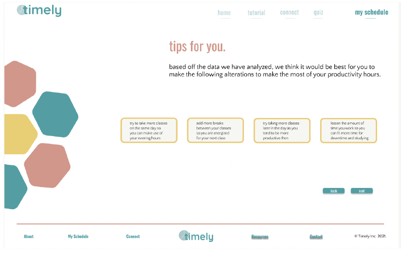
New Feature: Tips
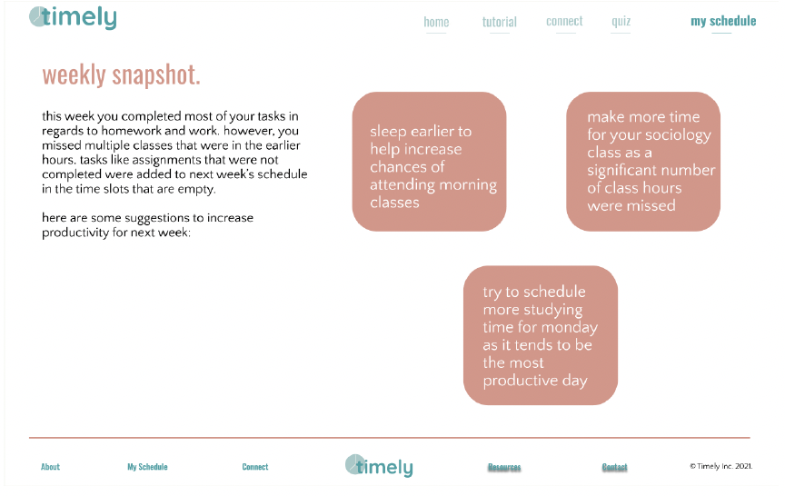
New Feature: Weekly Snapshot